Case study · Brand · Delivered, November 2026

A little bot that reads, marked.
Kai-Tech is a friend’s small consultancy in AI, data engineering and the digital humanities. I made its whole identity: the mark, five colourways, the type, a brandbook in HTML, a motion guide and every file it needs, from the favicon to the email signature.
- Role
- Brand designer
- For
- A friend’s consultancy
- Directions
- 3, to one mark
- Delivered
- November 2026
01 · Directions
The same idea, fewer parts.
The starting draft had the right idea, a bot reading a book, but it was an illustration of some twenty parts, not a mark. Three directions kept the idea and cut the face down to two signs, each tried on light and on colour, as a favicon and in a phone header.



02 · The mark
Text, marked.
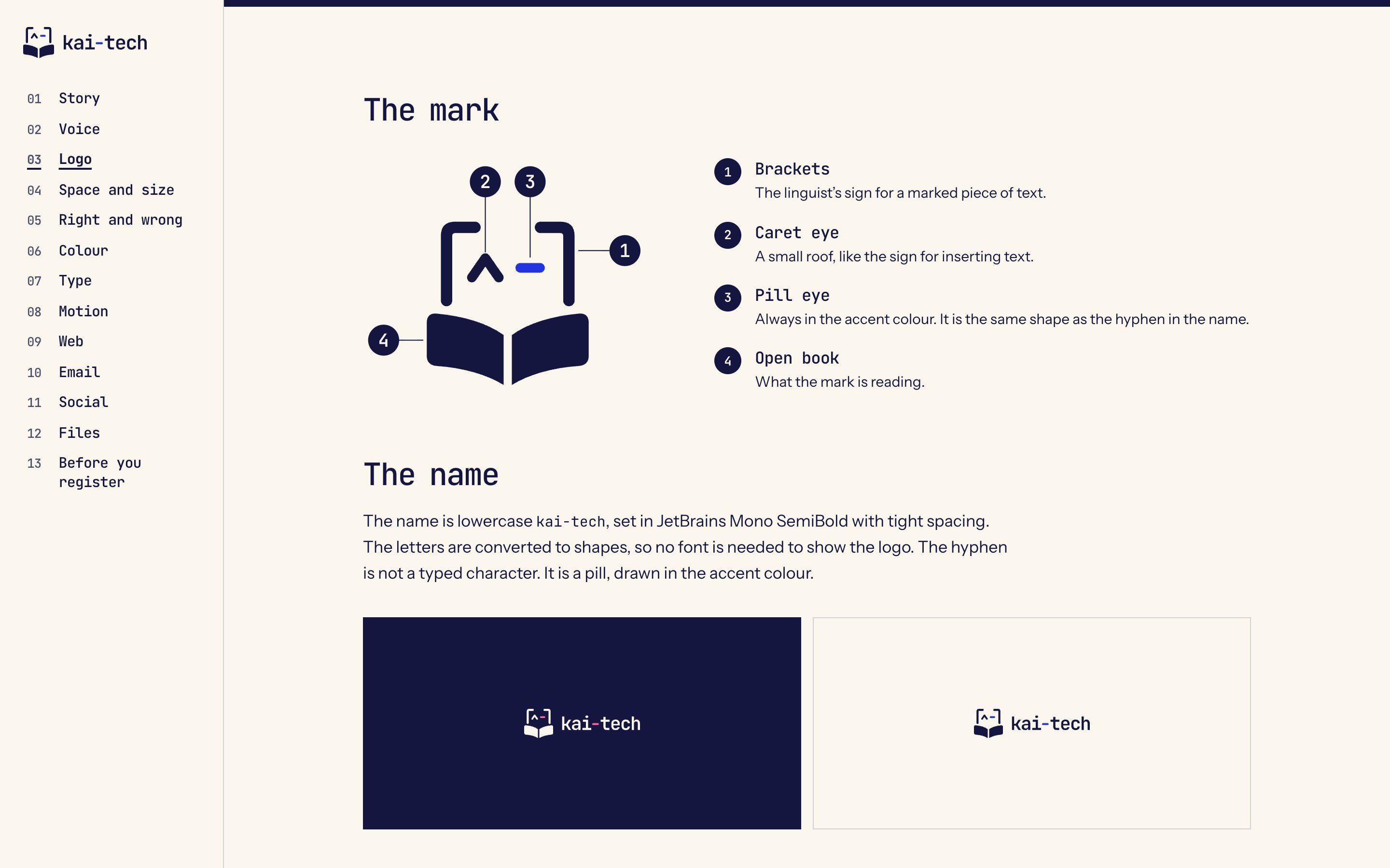
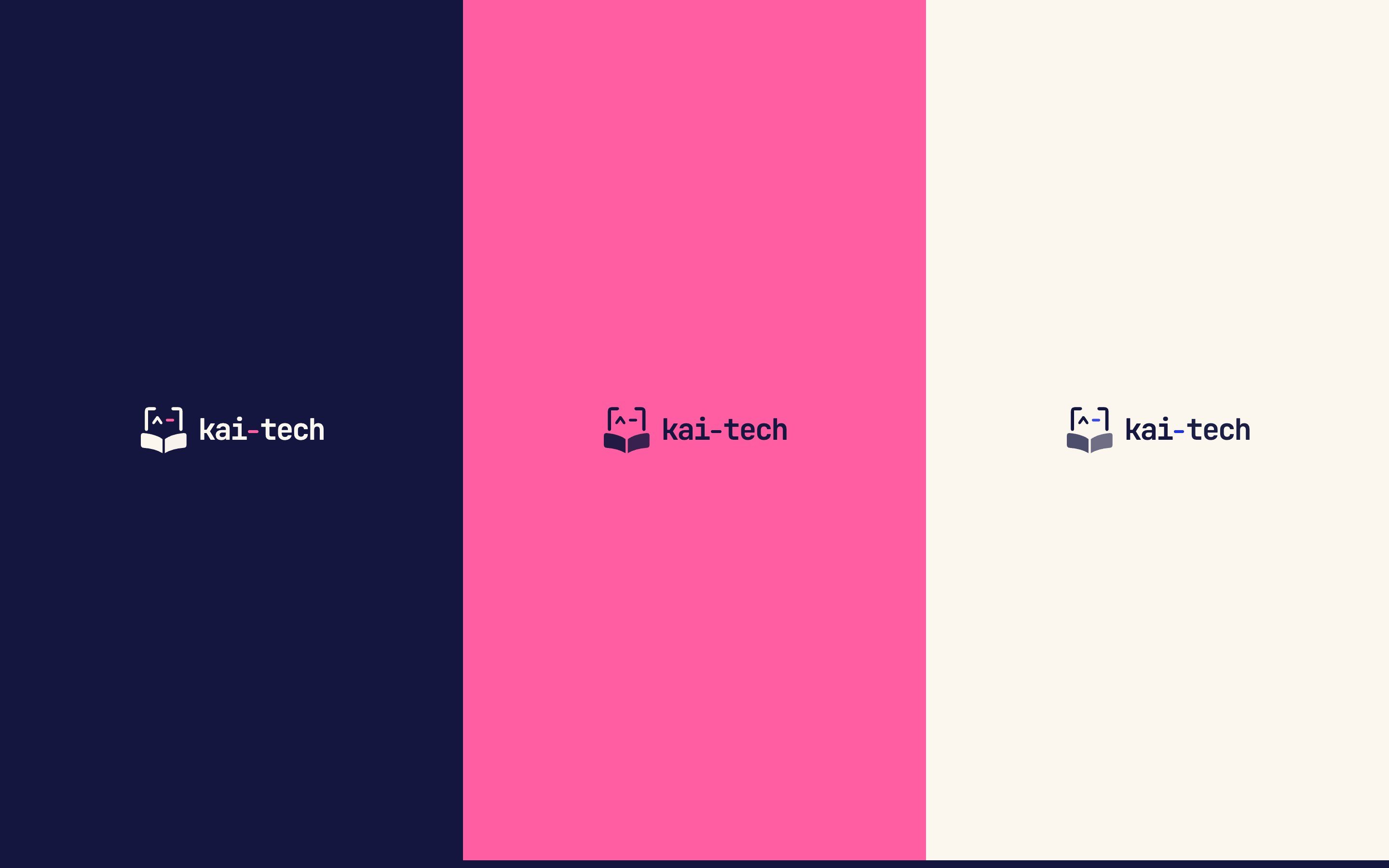
Square brackets are how linguists mark a piece of text. Inside them, a caret and a pill make a face that reads, and the open book is what it’s reading. The name is set in JetBrains Mono and turned into shapes; its hyphen is the same pill as the eye.
03 · Colour
Five colours, clear jobs.
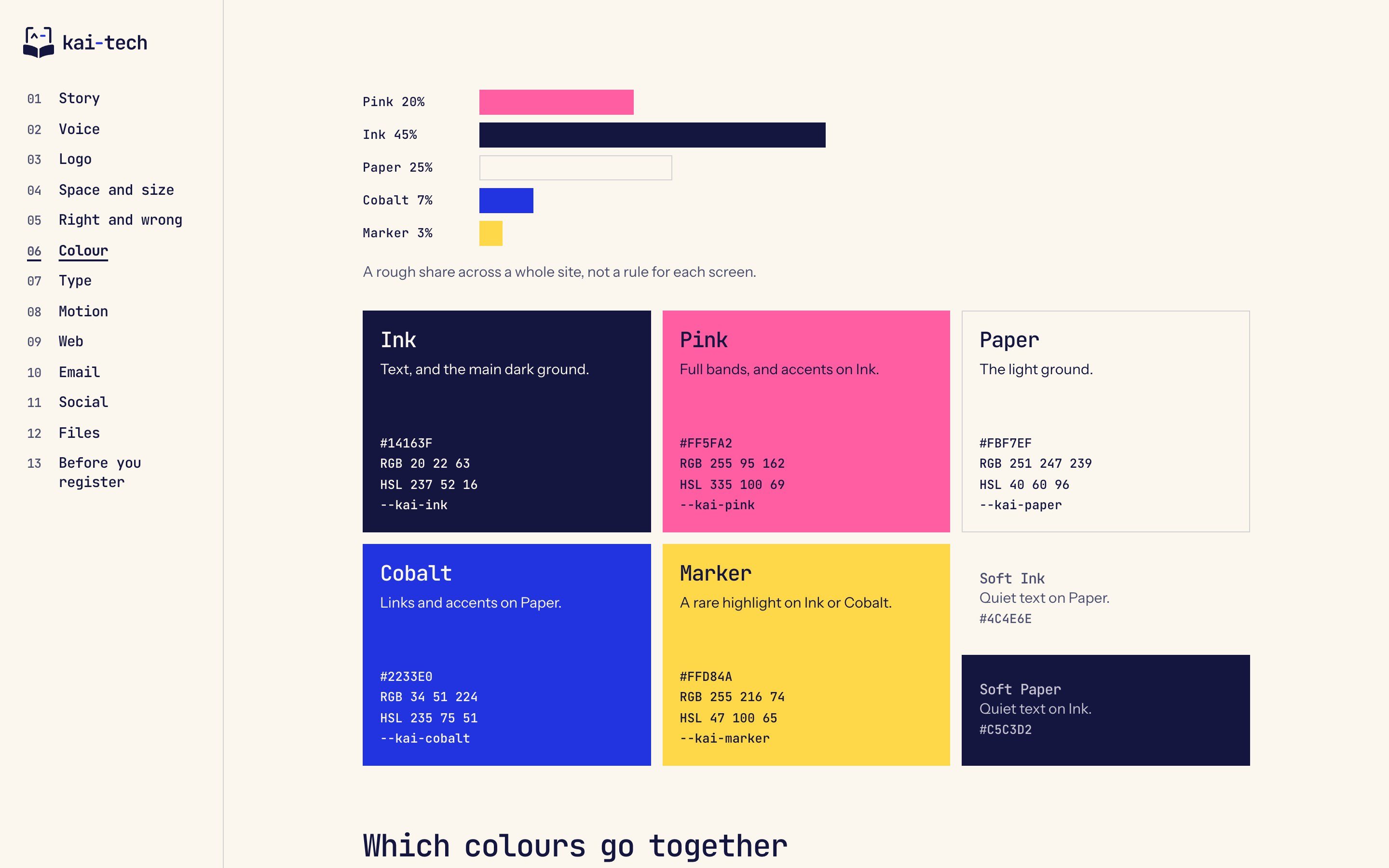
Ink for text and dark grounds, pink for bands, cobalt for links, marker yellow as a rare highlight, paper for light grounds. Every pairing was checked for contrast and against colour-blind vision, and pink and cobalt never touch.
04 · Motion and web
Soft, always.
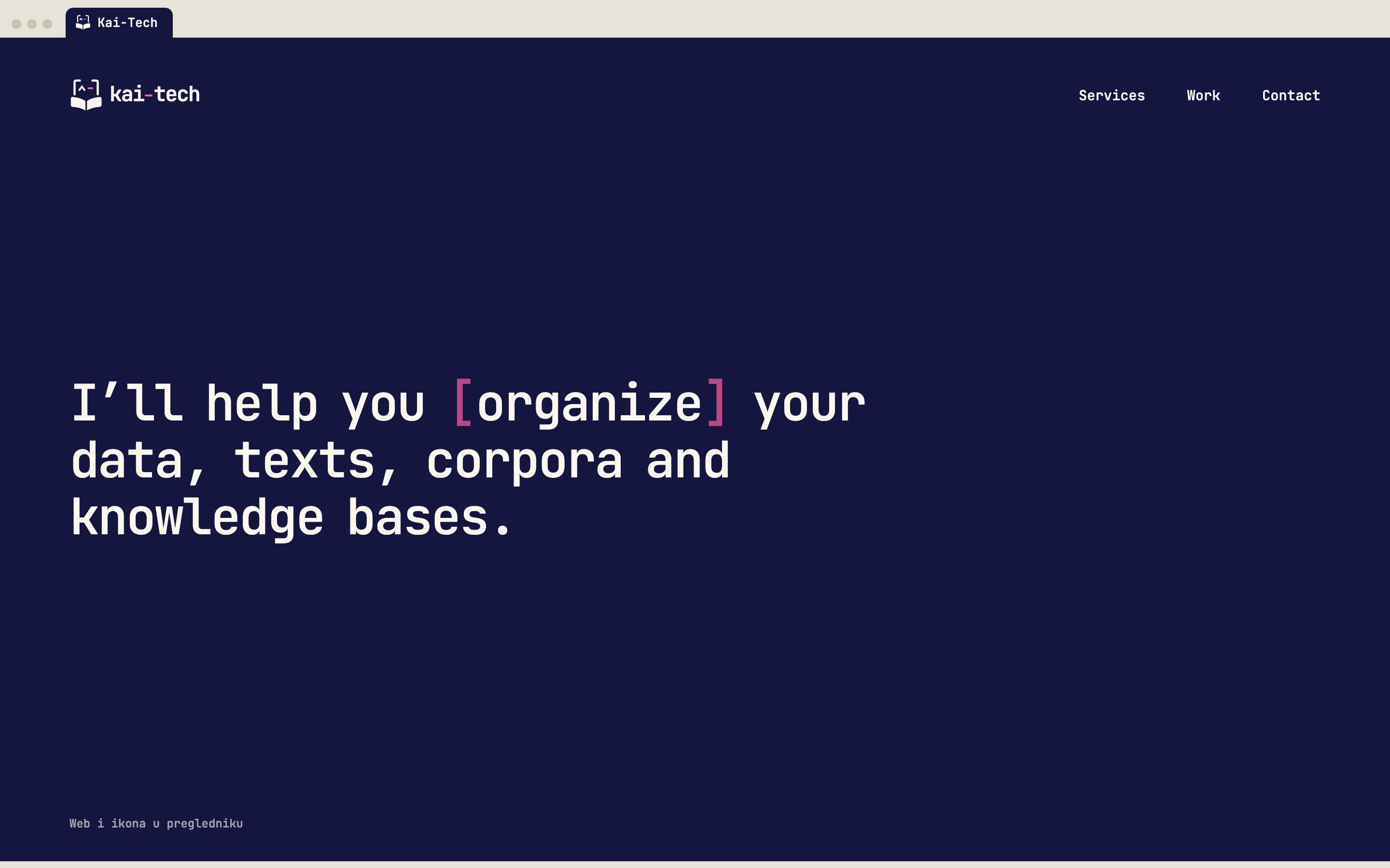
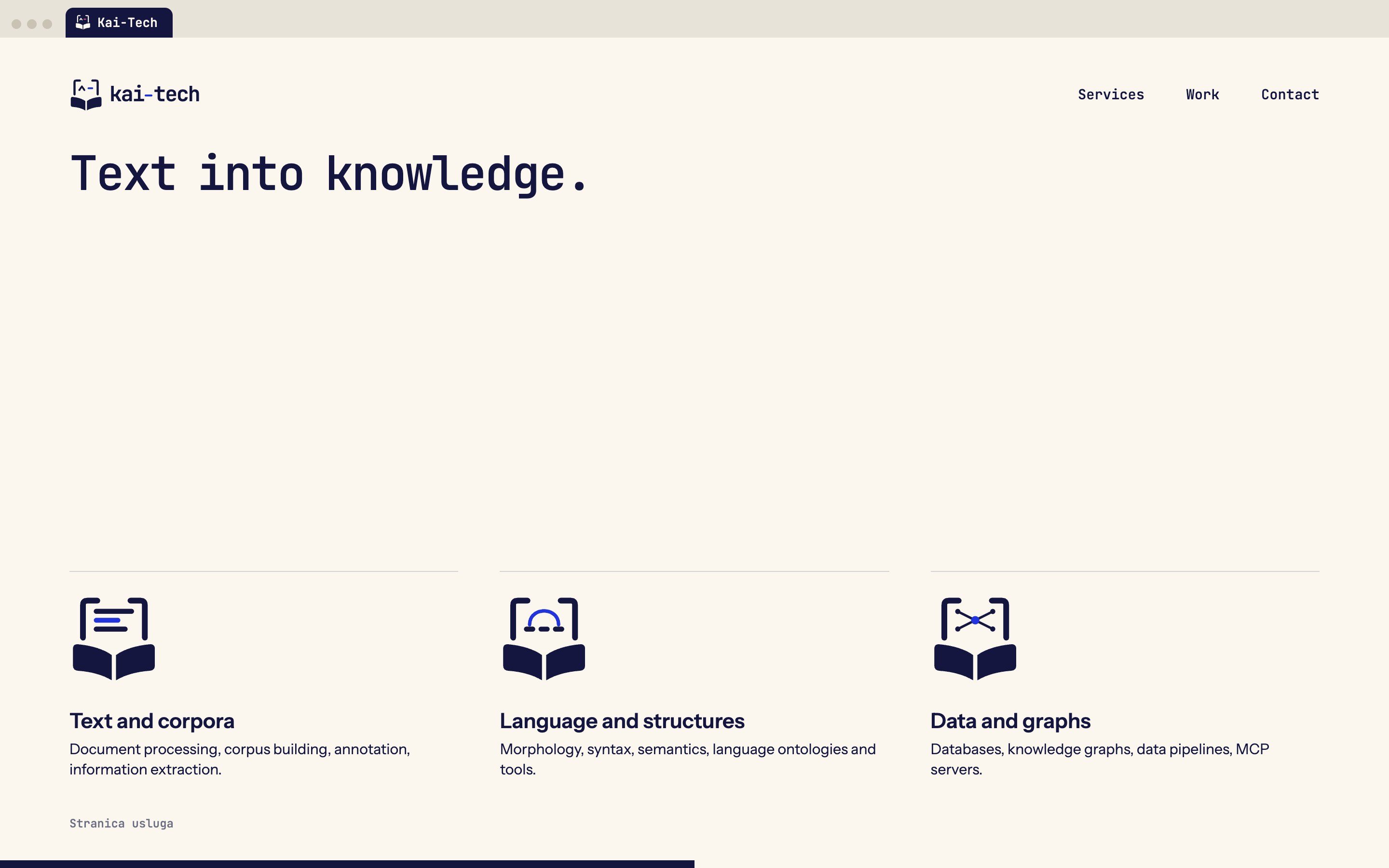
The mark stays simple; everything else lives in motion. Its line opens into lines, an arc or a graph for each service and folds back, and the brackets mark one word in a headline. A guide and a working reference page tell whoever builds the site exactly how, down to reduced motion.
05 · The package
Every file, in one folder.
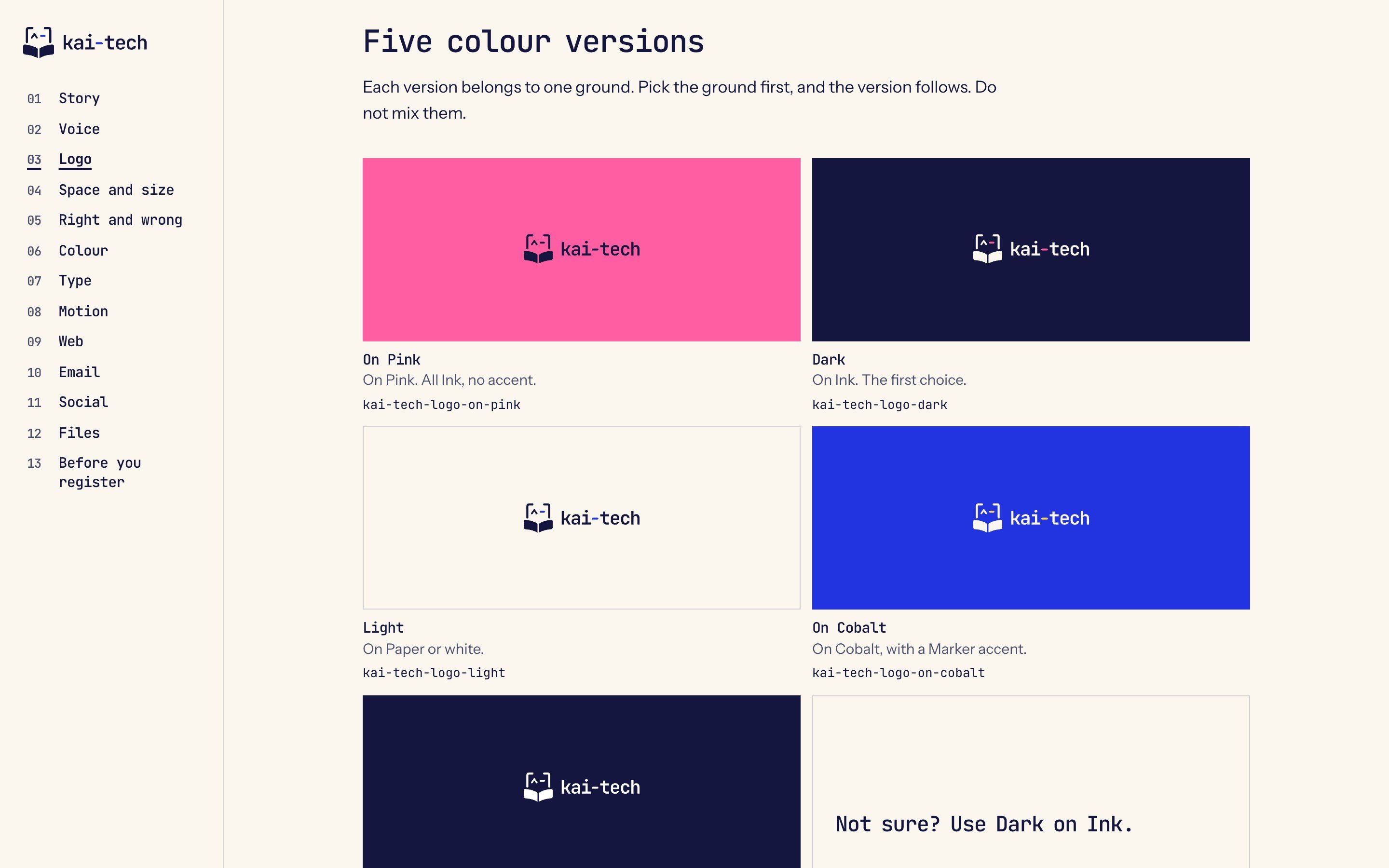
Logo and mark in five colourways as SVG, PDF and PNG, a small mark for 16 to 32 pixels, favicons and a share image, LinkedIn profile and cover pictures, an email signature, the colours as CSS, and font licences. The brandbook says which file goes where.

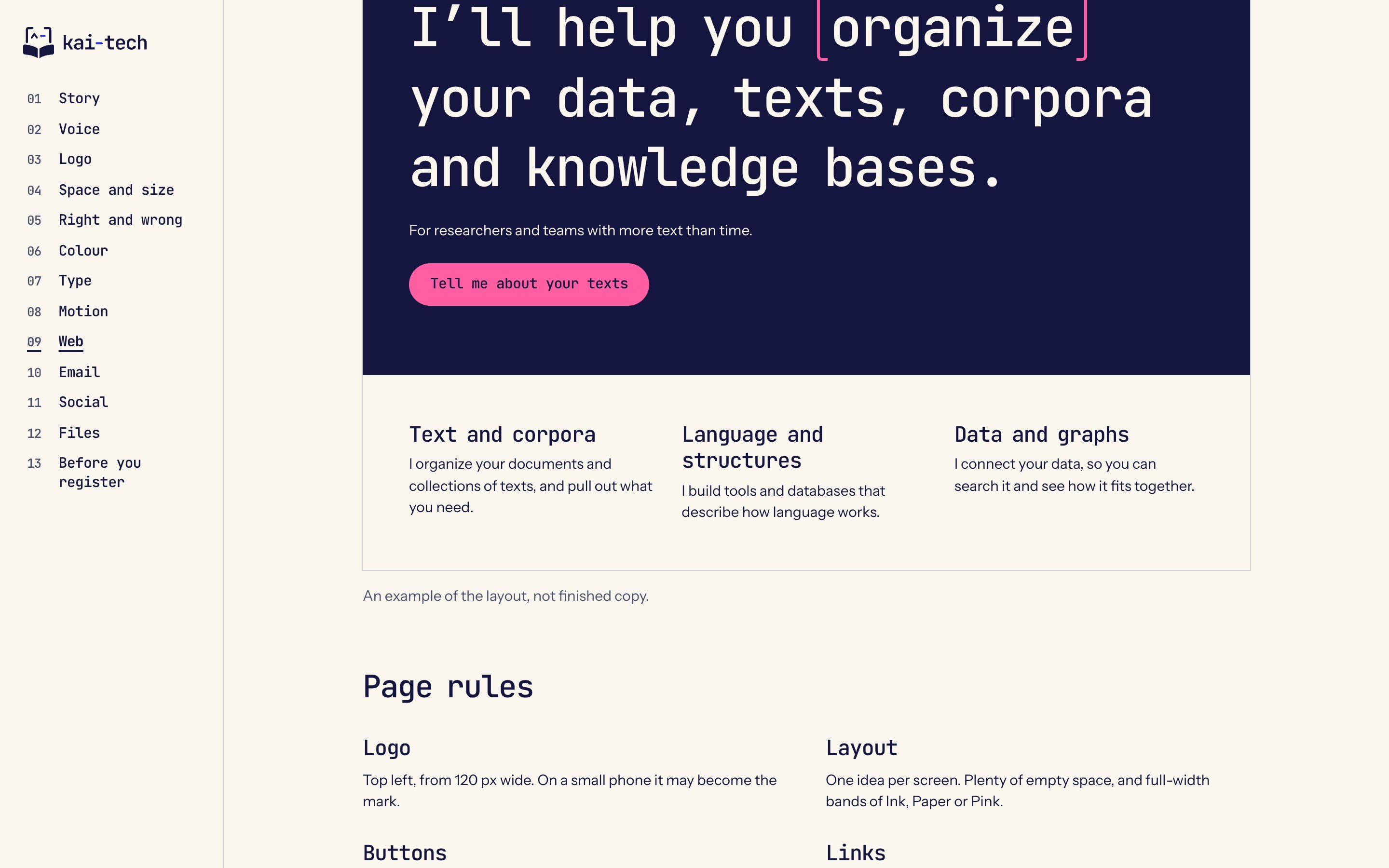
Pages of the brandbook and the motion reference, November 2026. The website shown is an example layout.
Let’s build the whole thing.
Contact me© 2026 Goran