Case study · Own product · On the App Store
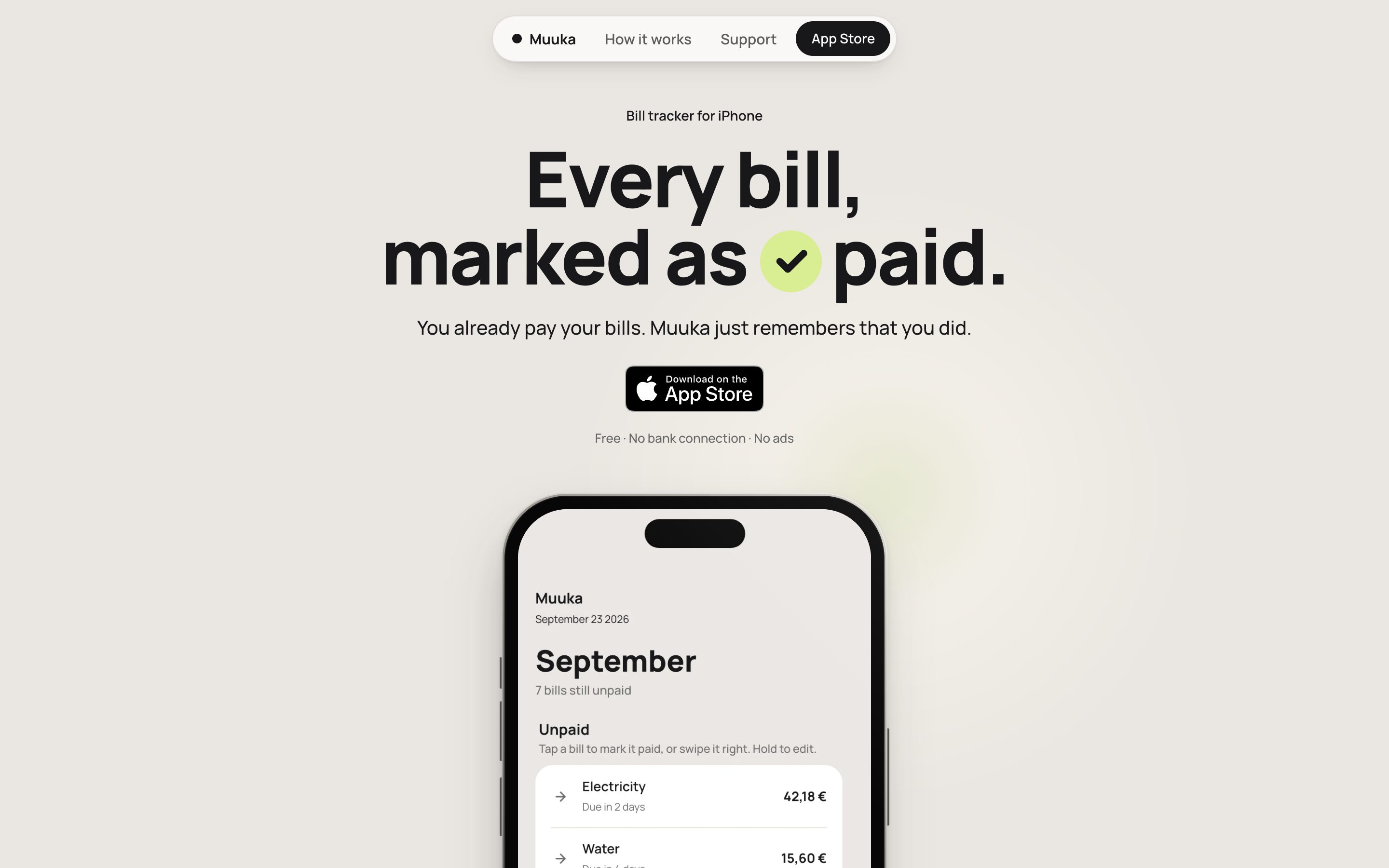
Every bill, marked as paid.
Muuka is an iPhone app that remembers which bills you have paid. It is my first app: from a spreadsheet to the App Store in 15 days. I designed it and built it with AI. I didn’t write the code, but I checked every change on my phone before it went in.
- Role
- Founder
- Platform
- iPhone, free
- Released
- 23 September 2026
- Updates
- 3 in two weeks
01 · The brief
One sentence, before any screen.
For years I kept my bills in a spreadsheet. It worked, but it lived on a desk, and when someone said I hadn’t paid something, I had no quick way to check. The brief started with one sentence, and every idea that added a tap was cut against it.
“I open Muuka and mark a bill paid in ten seconds.”
The brief, and what Muuka is not:
- It doesn’t pay bills
- It doesn’t connect to a bank
- It isn’t a budget
- No ads, no tracking
02 · Three designs thrown away
Built, tried and dropped.
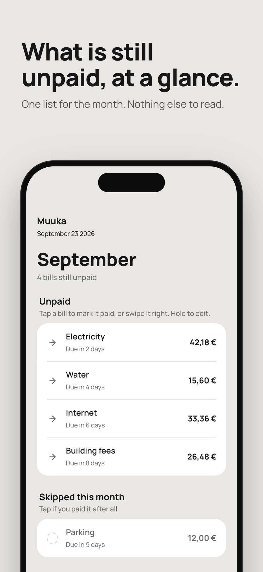
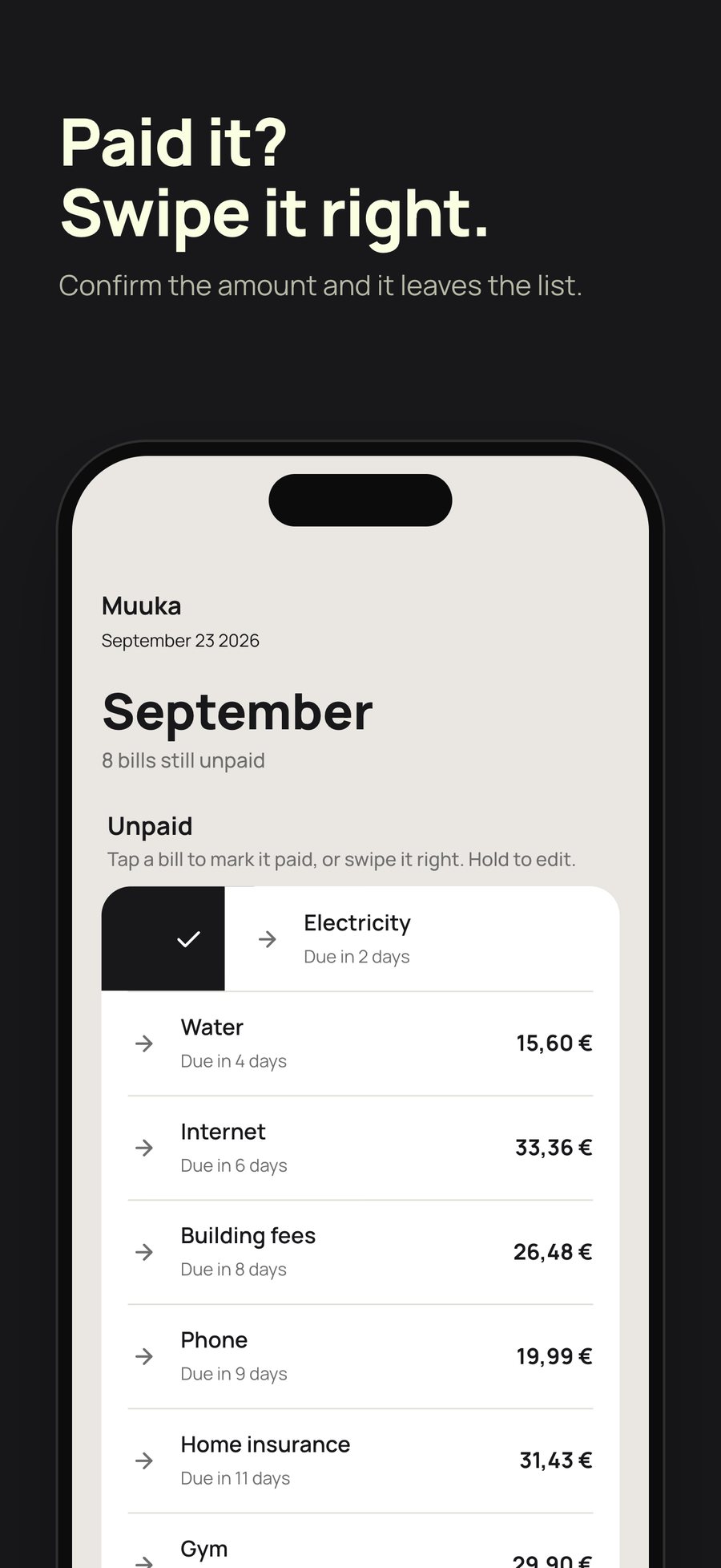
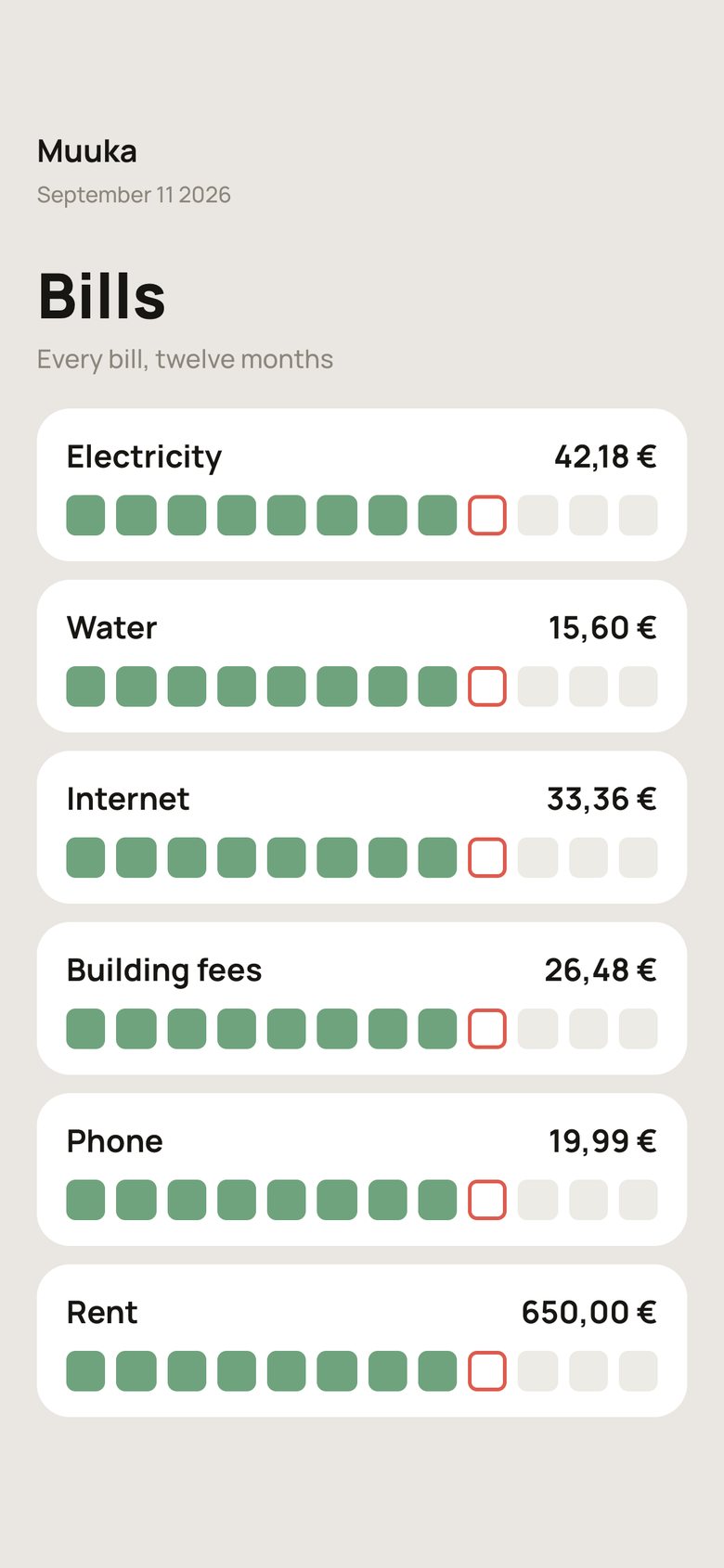
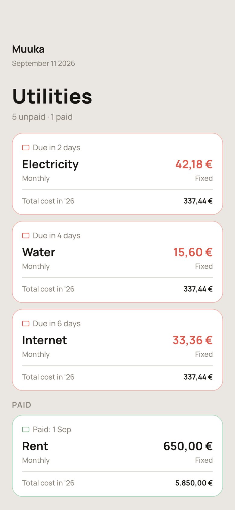
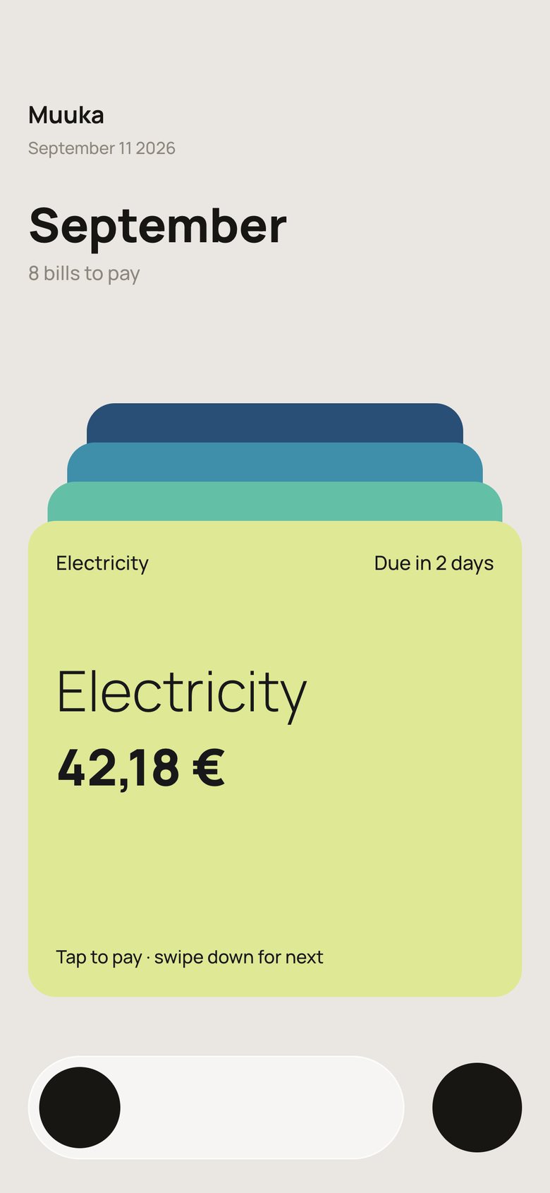
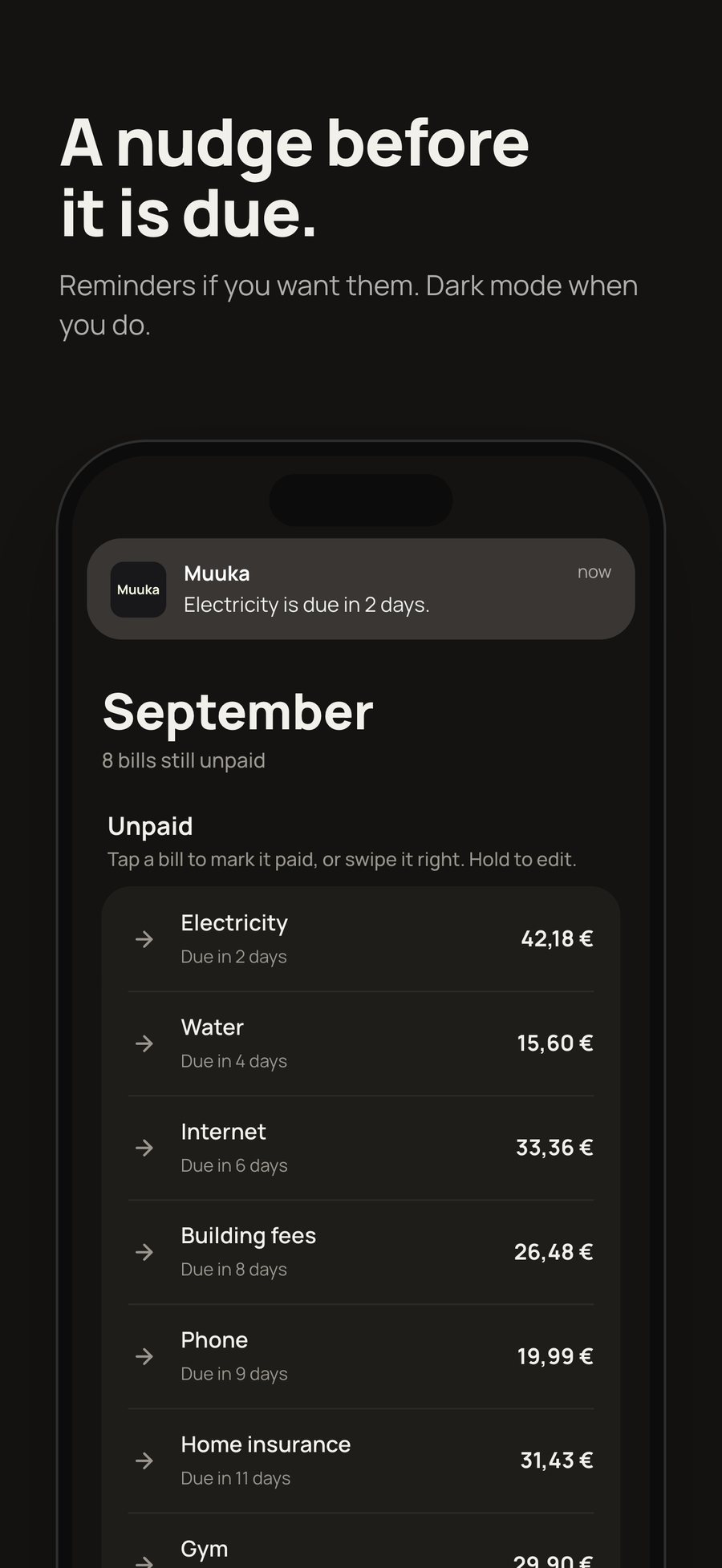
With AI, a wrong design costs so little that I could build each idea and try it on my phone instead of imagining it in Figma. A year of squares was lovely and useless for marking a bill paid. Cards true to Figma came next, then a swipeable stack that took two days. What stayed is a plain list: one row per bill, an arrow while it waits, a tick when it’s paid.
03 · The app
One meaning, one look.
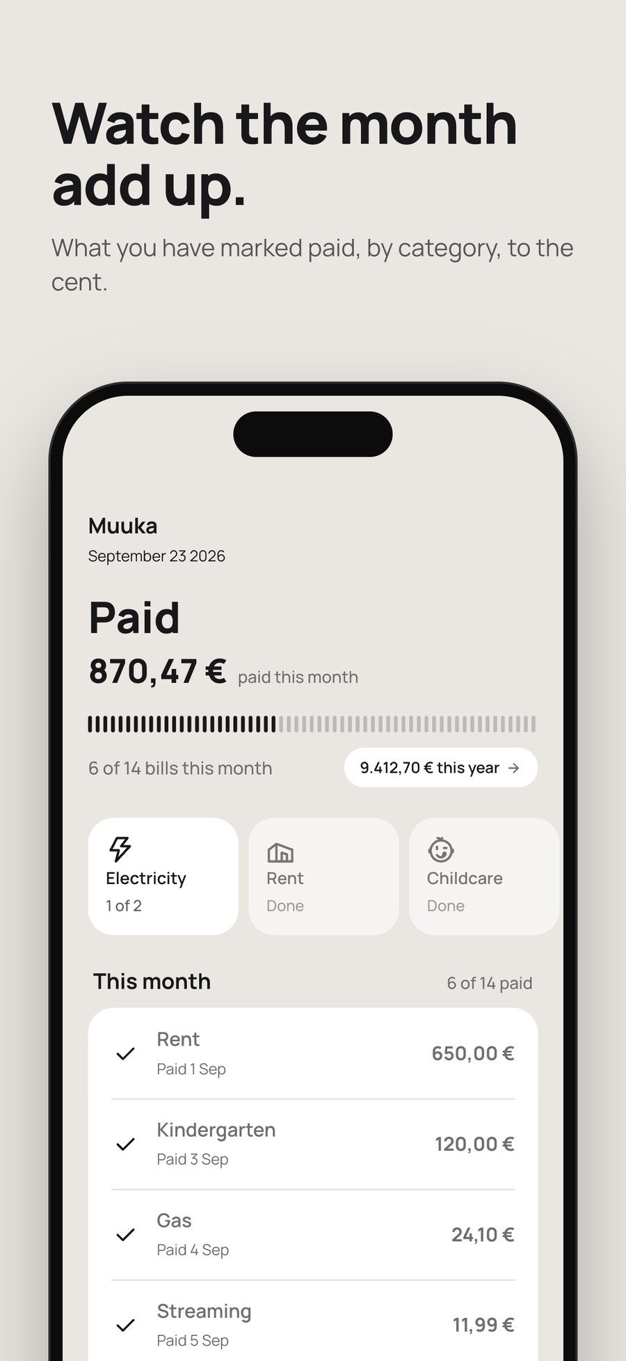
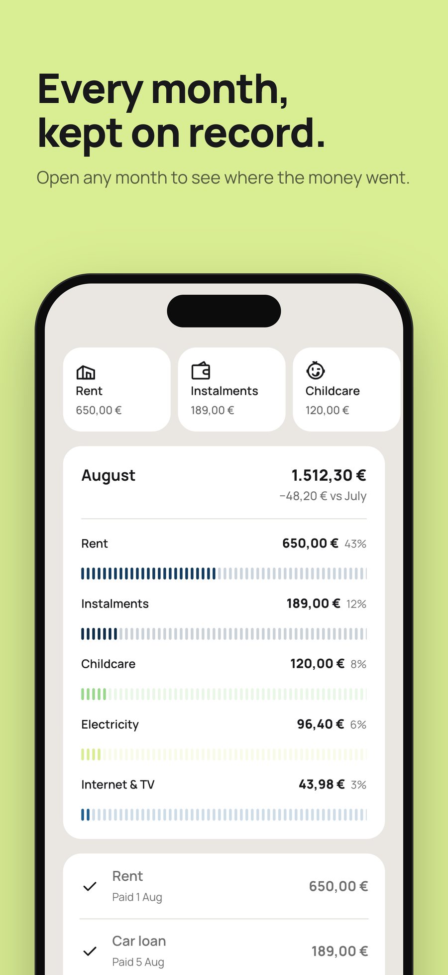
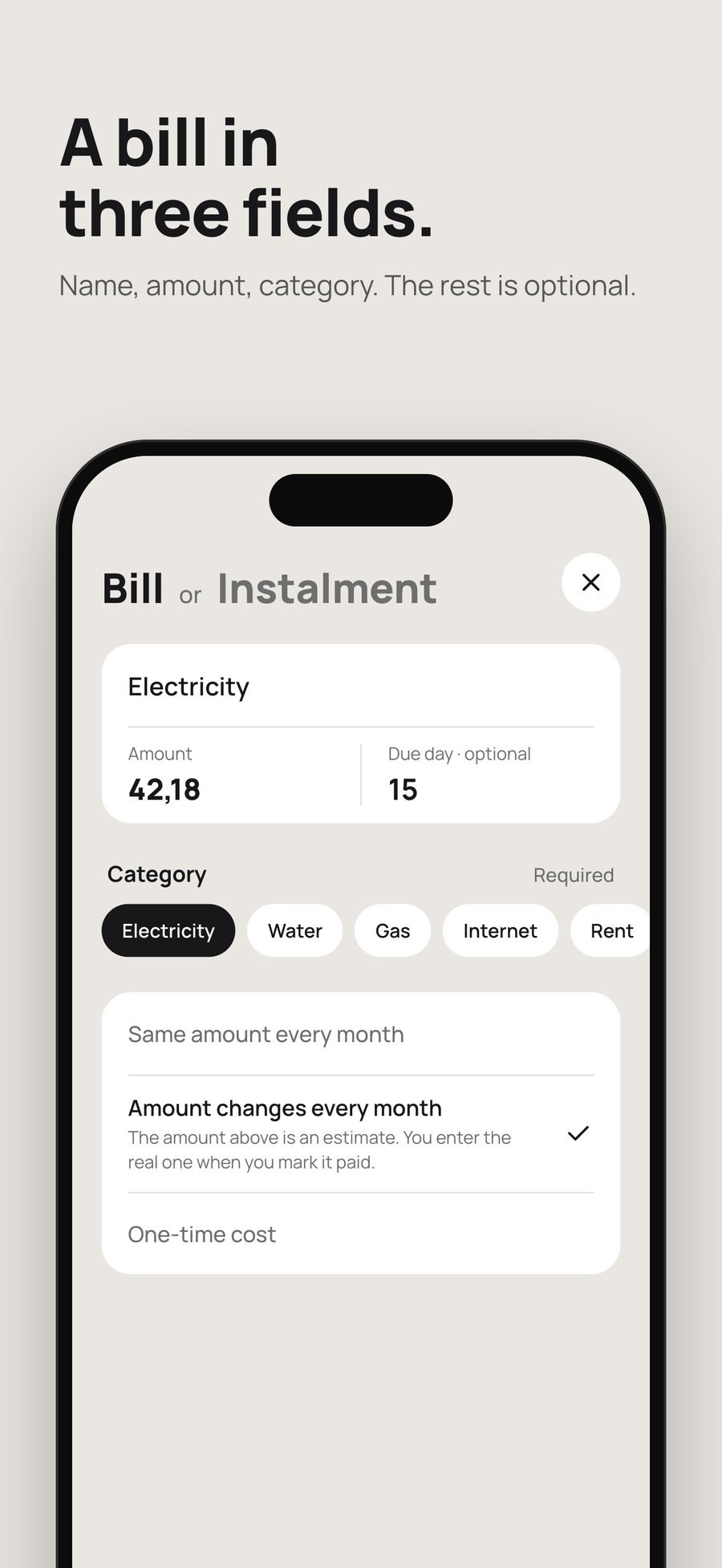
Once the list won, the same row went everywhere. An arrow means it waits, a tick means it’s paid, a dashed circle means skipped this month. Home is built to be empty, Paid collects the month, and the Calendar keeps the year to the cent. The store screens are drawn from the app’s own colours and icons, so one command redraws them when the app changes.
04 · The road to the store
Apple asked, and the answer found a bug.
The part no mockup shows: reminders, deleting your account, signing in with Apple without losing anything, the store listing, and the review. I did every step by hand, one at a time, so I would understand it.
- 18 SepSent to Apple for review.
- 19 SepApple asked for a screen recording of the whole app and six answers.
- RecordingThe video caught a real bug: after deleting an account, the app stayed on the wrong screen. Two builds later it was fixed and recorded again.
- 23 SepOn the App Store.
- 2 weeksThree updates: 132 currencies and a shorter form, fixes after a demo to designer friends, and fixes from my own use.
05 · The product page
A website in the app’s own language.
Same warm paper, same rows, same tick. The page walks through the routine and ends on what Muuka is not. A plain static site: no framework and no tracking.
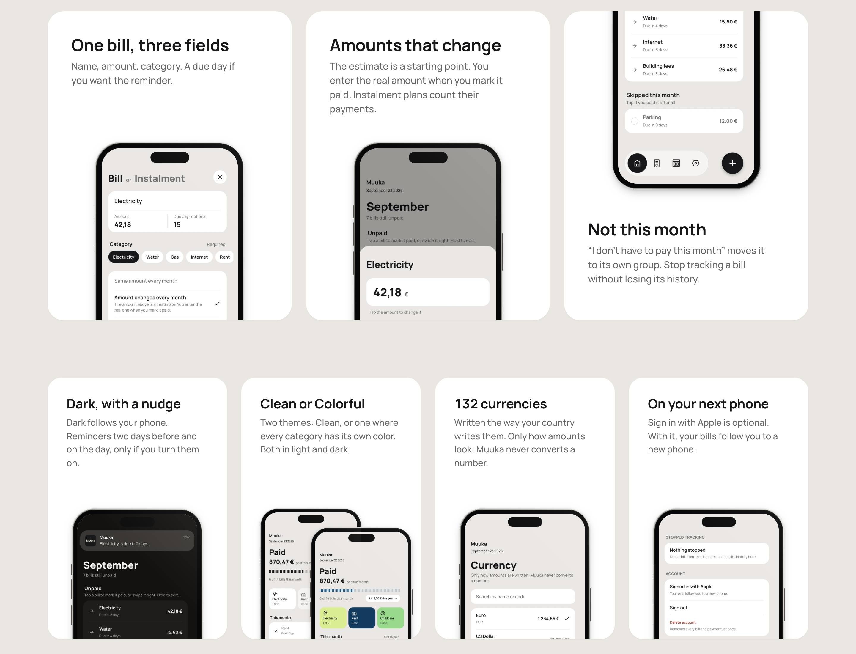
App Store screens of Muuka 1.0. Amounts are examples.
Let’s build the whole thing.
Contact me© 2026 Goran