Case study · Brand · Handed over, November 2026

A ball’s path, drawn in one stroke.
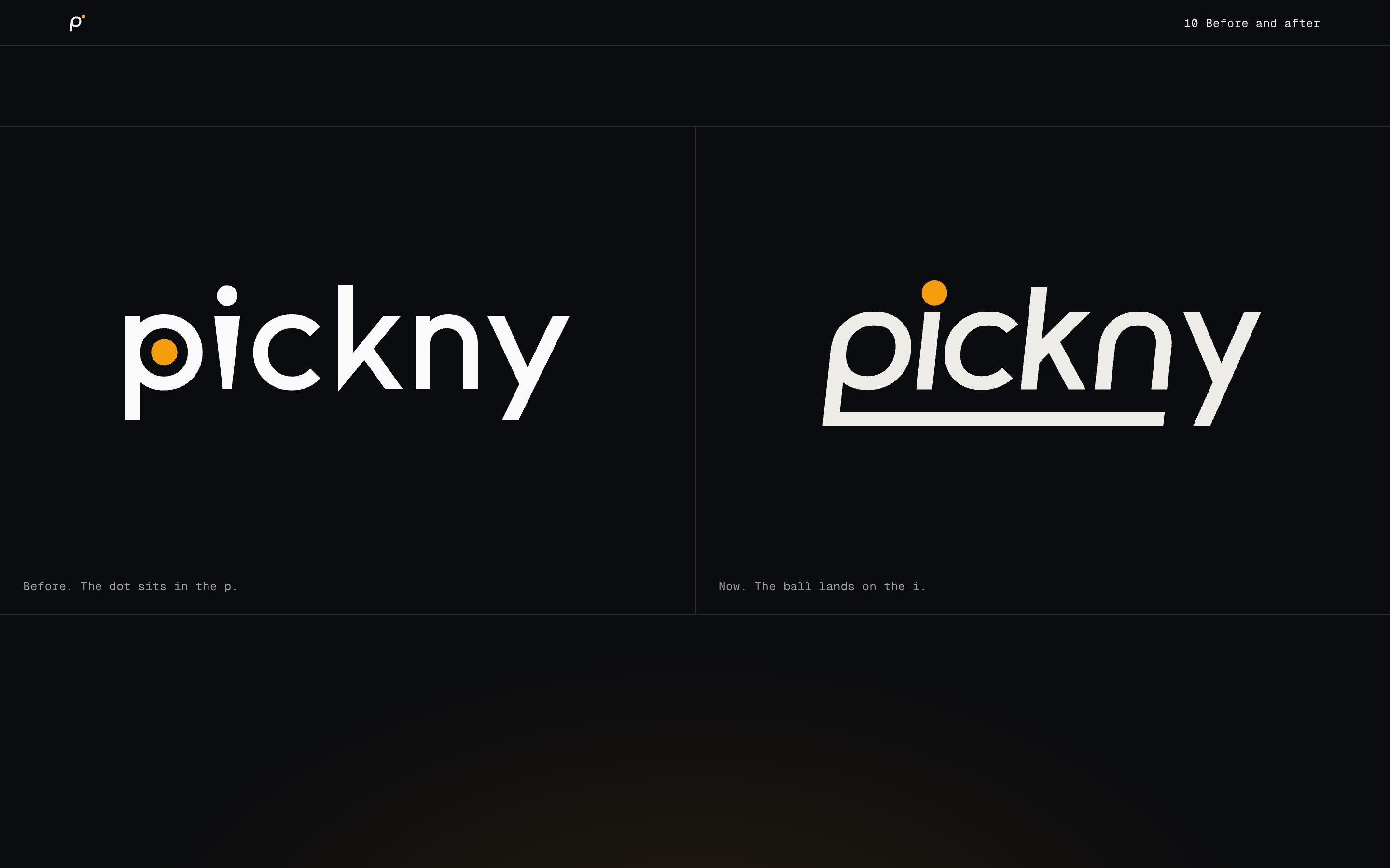
Pickny’s new mark is one line. It follows the ball under the word, closes the p, and the ball lands as the dot on the i. I directed three rounds, chose at every step, and handed the mark, its motion and a brandbook to Pickny’s developers.
- Role
- Brand and art direction
- For
- Pickny
- Rounds
- 3, to one mark
- Handed over
- Mark, motion, brandbook
01 · Three rounds
From three ideas to one mark.
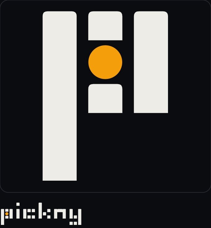
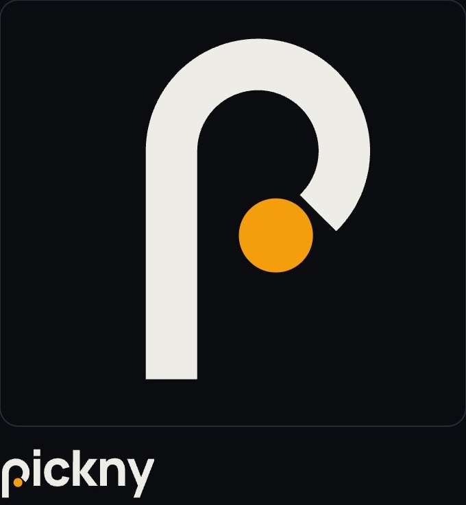
Each round put a few directions side by side, drawn and moving, and I chose one to take further. The notes under each round are what decided it.
Round 1 · Three directions

Round 2 · Path, deeper
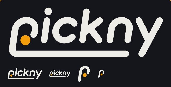
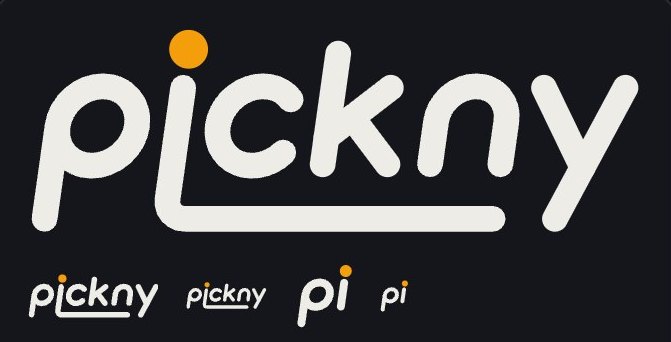
Jump won, but it felt too round for the product, too heavy at small sizes, and its favicon read as a q.
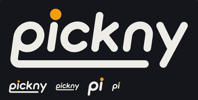
Round 3 · Four cuts of Jump
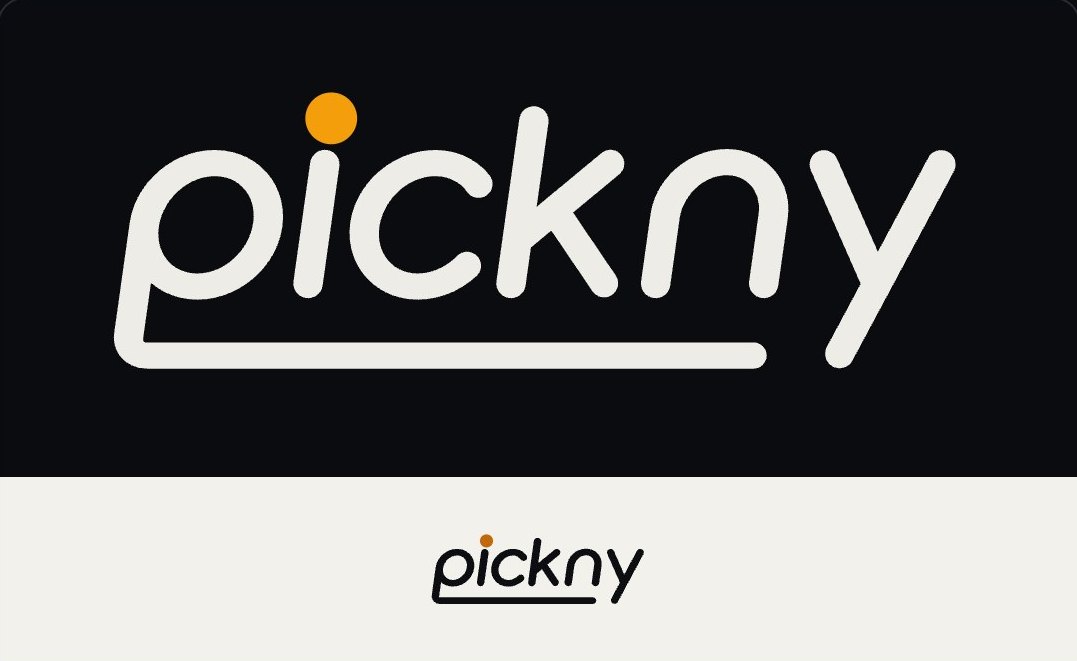
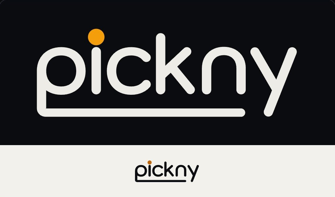
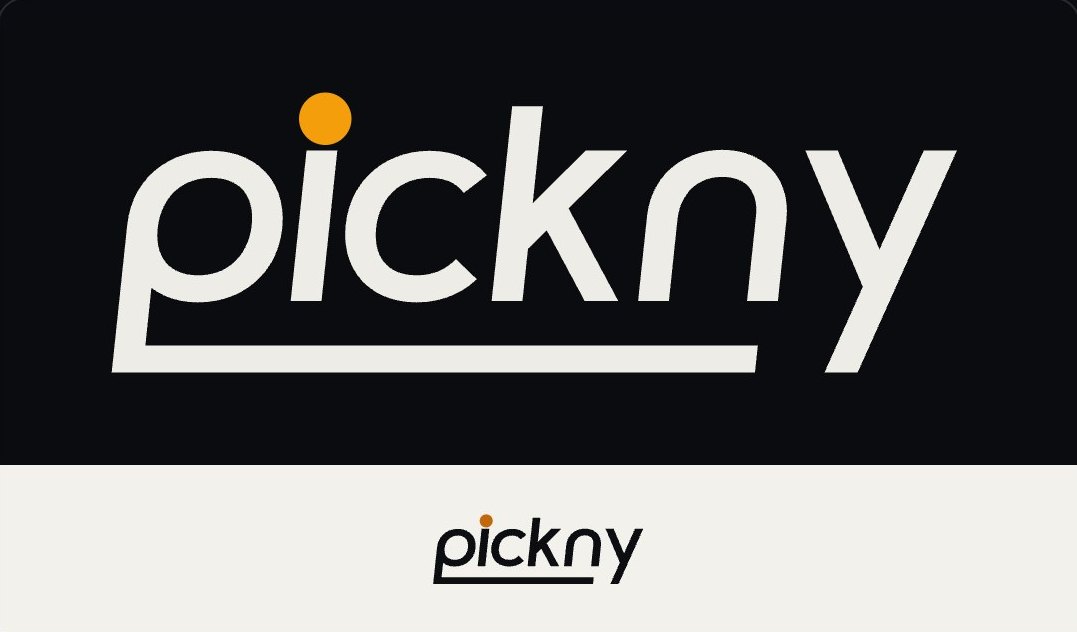
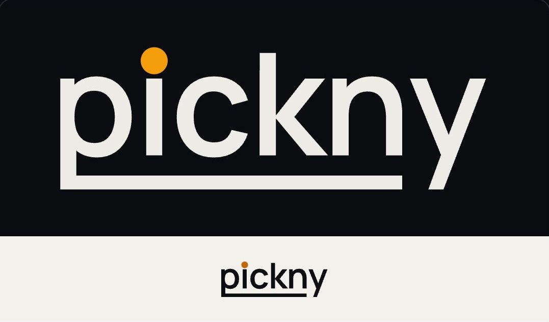
Cut is the least round and the most sport. The favicon became the p and the ball alone, so it can’t be read as a q.
02 · Motion
The ball has weight.
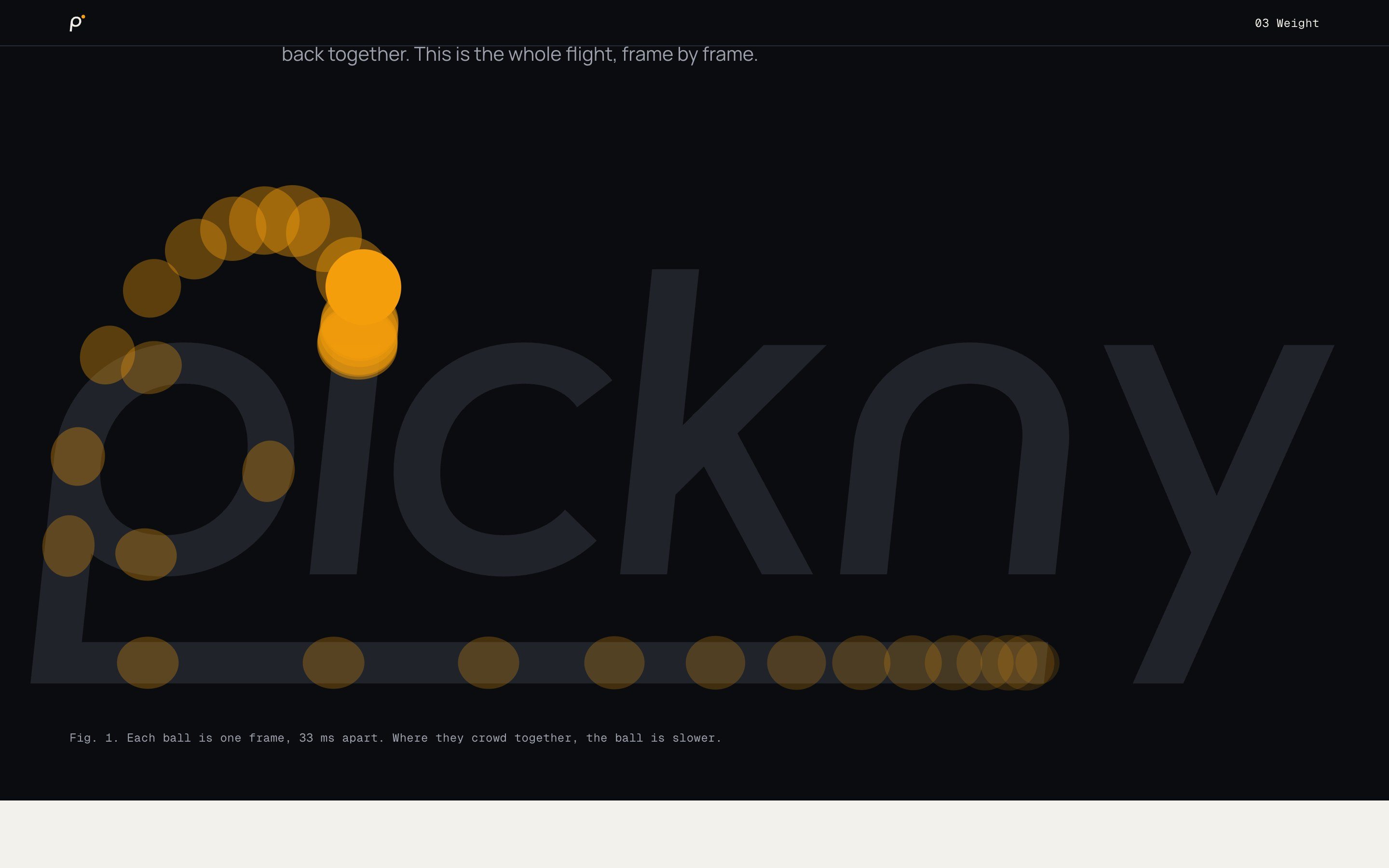
The mark moves on the product’s own clock. Digits spin into the letters like the numbers in the app, the ball slows at the top of its arc, lands on the i, pushes it down, and they rise back together. Then it stands still. On hover, the ball lifts and waits.
03 · Drawing
Drawn, not typed.
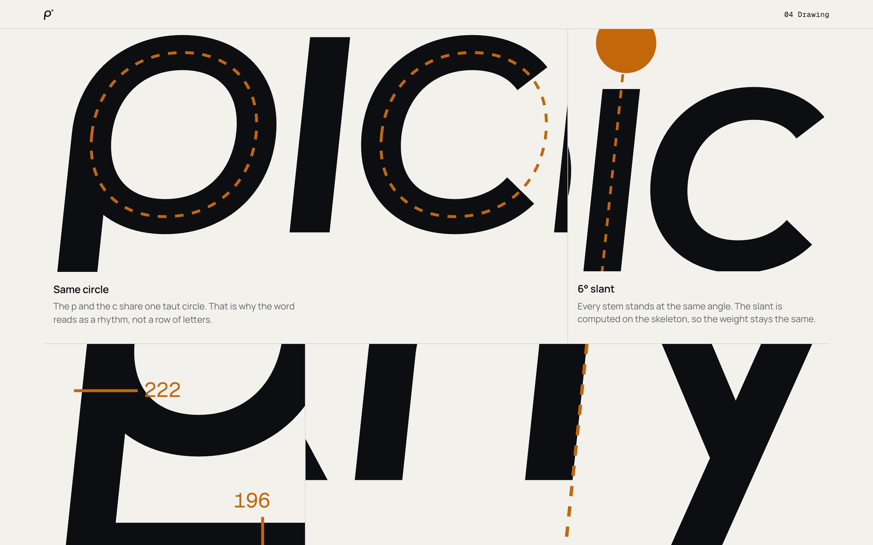
The letters don’t come from a font. They are one line, drawn with the same rules as the ball’s path: the p and the c share one circle, the slant is set on the skeleton, and every stem leaves from the middle of the line.
04 · Colour
One word. Four balls.
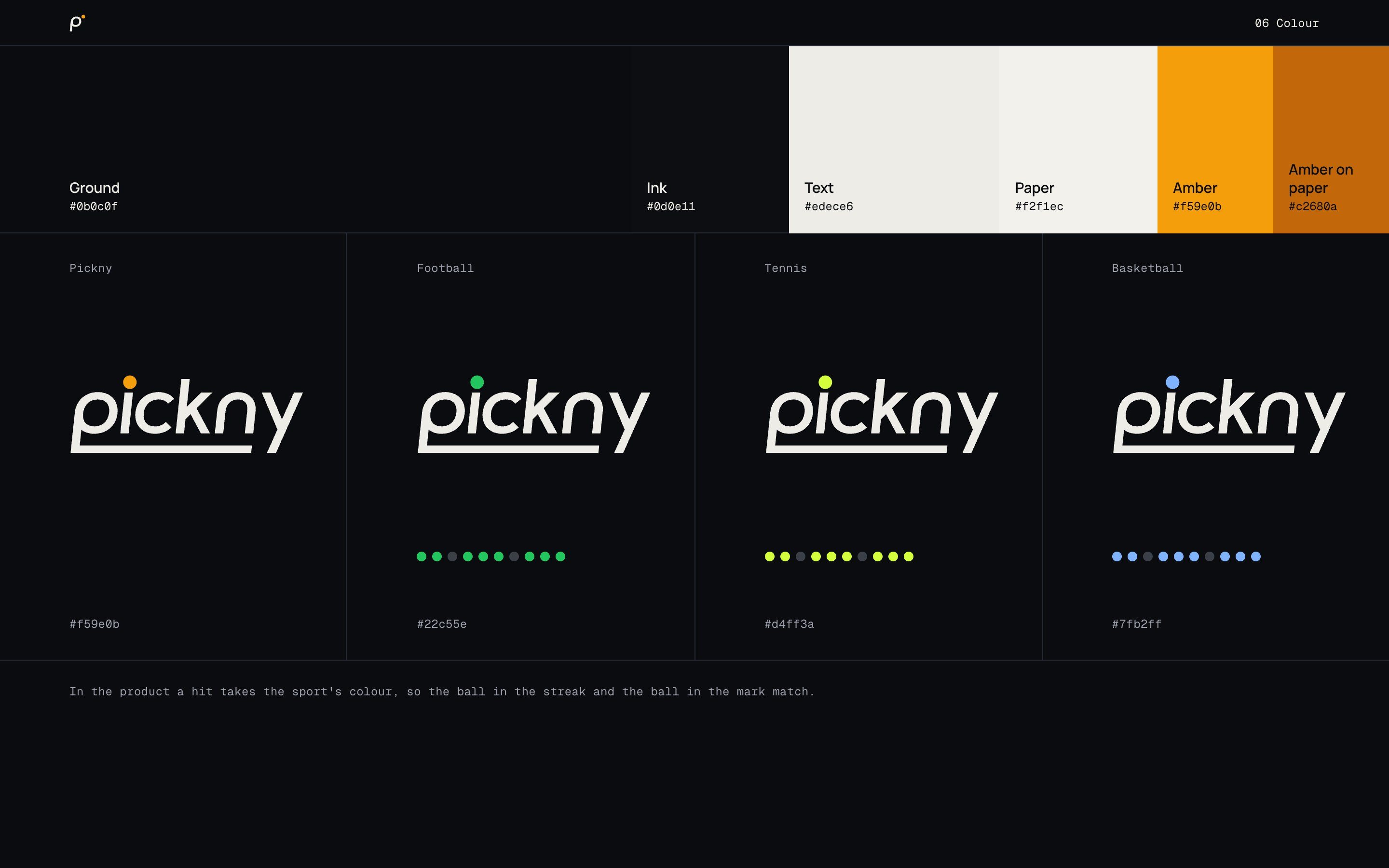
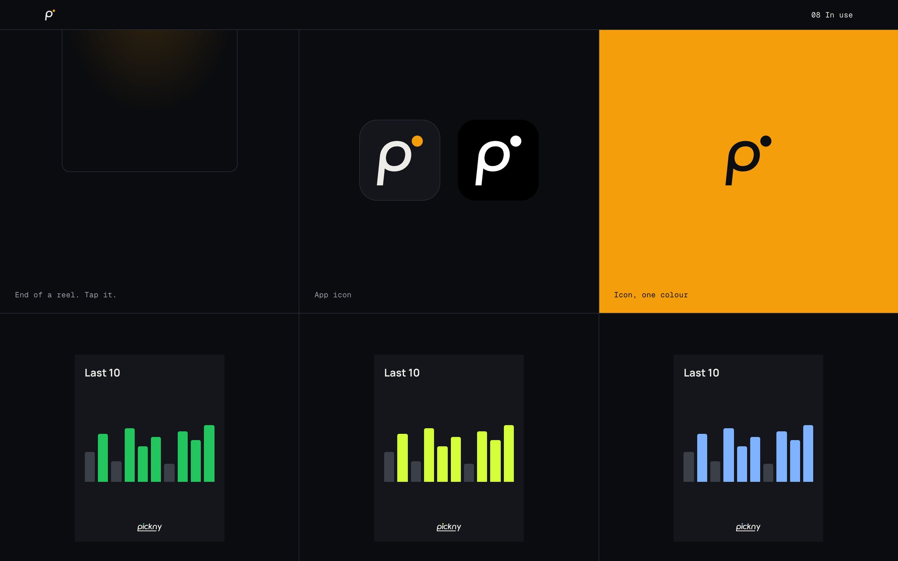
The word is always one colour; only the ball changes. Amber for Pickny, and the product’s own sport colours: green for football, yellow for tennis, blue for basketball. Sport colours go on dark only, because on paper they fade.
05 · In use
From 13 pixels to the end of a reel.
The app icon, the header, posts for each sport and the end card of a reel. Next to the old logo, the word is the same, but now it has a story.
Frames from the brandbook, November 2026.
Let’s build the whole thing.
Contact me© 2026 Goran